Overview
A crypto market analyst named EGRAG Crypto shared a new chart about XRP. He says traders should spend less time on news about wars or politics. Instead, they should study XRP’s long‑term price pattern. This means looking at how the price has moved over many years, not just in days or weeks.
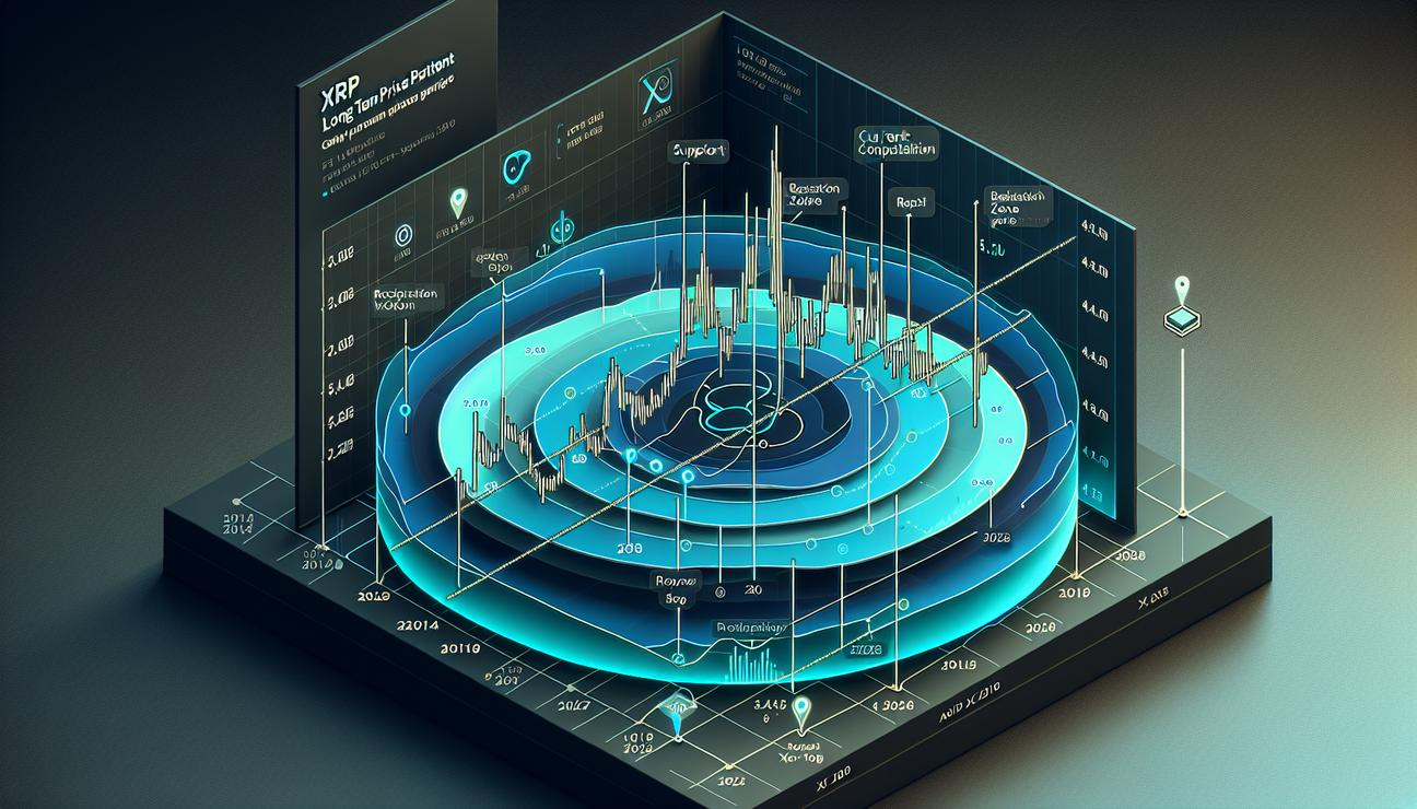
EGRAG’s goal is to show that the most important signals for XRP are in its long‑term structure. A chart he posted looks at how the price could move from now into the next several years. It outlines a simple path: a possible bottom in a big market move (a macro bottom), a nearby level where the price could break out, and targets that could run many years into the future.
The chart’s three key phases
The chart traces XRP’s price from 2014 all the way toward 2028. It highlights three main phases:
- Previous cycle bottom: the lowest price reached in the last big market cycle.
- Current consolidation zone: a period when the price moves sideways inside a range, not making big new highs or lows.
- Potential breakout stage: a time when the price could move higher and start a new multi‑year rise.
In simple terms, the chart tries to show where XRP stood before, where it is now staying for a while, and where it could go next if the price breaks through certain levels.
Long‑term signals and a rising support line
The analyst believes the strongest signals are found in the long‑term setup. The chart suggests XRP is stabilizing near a support trendline that has been rising since the 2018–2019 bear market bottom. A trendline is a straight line that connects price points to show the direction of a price trend. A support line is a price level where the price tends to stop falling and may bounce back up.
That rising trendline intersects the recent consolidation zone. This is the area where EGRAG says the next big bottom could form. If the price follows the chart, a final shakeout—a last move lower to shed weak holders—could happen around the $0.50 level in late 2025. After that, the price could move back toward the $1 area.
What would confirm a bigger uptrend?
The next step in the chart’s plan is confirmation. EGRAG points to a horizontal resistance zone around $1.00 to $1.40. A resistance level is a price area where the price often stops rising and reverses. For a longer‑term bull (upward) expansion to begin, XRP would need to break above this resistance. If the price can flip that level into support (meaning it becomes a floor rather than a ceiling), the chart shows XRP entering a multi‑year upward channel.
From there, the long‑term projections point toward the 2028 timeframe, with targets well above $27 during the next cycle’s expansion. In short, the chart argues that taking a big view of price structure is more important than reacting to short‑term news events.
Near‑term thresholds to watch
The analyst also discussed some important near‑term price levels. Earlier in the week, he mentioned:
- A weekly close above $1.55 would weaken the downward trend that has held XRP inside a descending channel for months. A descending channel is a price pattern where prices move lower inside two parallel lines that slope downward.
- A break above $2.20 would invalidate the current bearish structure entirely, suggesting the trend could turn decisively higher.
Other market participants echoed similar technical ideas. One analyst named Arthur said his custom indicator crossed a trigger line that has historically preceded fast price moves. He pointed to a previous rally of about 27% within four days after a similar signal. Another trader, CW, noted XRP’s decline recently touched the lower line of its long‑term ascending channel, a level that has often marked where uptrends begin in the past.
Current price picture
At the time of writing, XRP was trading around the $1.40 level. It had fallen about 0.8% in the last 24 hours. On a weekly basis the drop was about 0.3%, and on a monthly basis the price was down around 12%. Looking at a full year, XRP remained more than 44% lower than its peak in 2025. This shows the scale of the correction since that high.
Overall, the chart and the other technical notes describe a market that is correcting in the near term but may form the base for a much larger rise later if key levels are breached and then held as support.
What this means for XRP holders
For people who own XRP or are thinking about buying, these ideas offer a few simple takeaways:
- Look at the big, long‑term picture rather than reacting to every news headline. Long‑term price patterns can give a sense of where the price could go over years, not just days or weeks.
- Pay attention to the key levels around $1.00–$1.40 and $0.50. If XRP can move above the $1.40 area and hold, a larger upward move could start. If it fails to hold, the price could drift lower before a possible rebound.
- Watch for the next confirmation signal. A close above $1.55 or a breakout above $2.20 would be important milestones that could change the trend direction.
As always in markets, nothing is guaranteed. Charts show probabilities, not certainties. Investors should consider their own risk tolerance and do their own research before making decisions.
This analysis and chart commentary come from CryptoPotato and other market observers who focus on price patterns rather than news headlines.
Glossary of terms used in this article
Below are short explanations of common technical terms. Each term is linked to a simple explanation on Wikipedia so you can learn more if you want.
- XRP Ledger — The XRP Ledger (XRPL) is a cryptocurrency platform launched in 2012 by Ripple Labs. It uses a native cryptocurrency XRP and supports tokens and other units of value; it operates using a consensus protocol rather than mining. Wikipedia
- Ripple Labs — Ripple Labs, Inc. is an American technology company that offers enterprise blockchain products on the XRP Ledger and other networks. It was originally named OpenCoin and renamed Ripple Labs in 2015 before later branding changes. Wikipedia
- Support and resistance — In stock market technical analysis, these are levels where prices tend to stop and reverse. A support level is like a floor for price, while resistance is like a ceiling. Wikipedia
- Trend line — A straight line drawn on a price chart to show the direction and strength of a price trend. It connects price highs in an uptrend or price lows in a downtrend. Wikipedia
- Technical analysis — A method of forecasting price movements by studying past market data, mainly price and volume. Wikipedia